W2: Discussion Post 2 – Discussion Group 1
Chapters 3 and 4 explored the visual elements and principles of design. For this post, let’s apply this to the world around us! You’ll also continue working on your description skills and finding meaning through the application the elements of art and principals of design. This will also help prepare you for your museum report as you’ll be asked to do many of these same things for that assignment.
- Select and embed one movie poster that advertises a recent film or one album cover (i.e. one that has been or will be released in 2020 or 2021) to visually analyze.
- Images are first come, first serve with your groups. You can see what others have posted about but I understand it’s disappointing when you’re working on a piece that someone else writes about it before you can.
- To get around this, you may ‘call dibs’ and reserve the work you’d like to post about. You’ll do this by commenting in the discussion forum on what you’re reserving.
- But please be respectful and post within 24 hours. Nothing worse than someone reserving a work and then not posting about it.
- In 250 words or more describe the image and include where you see two elements of art or principals of design. Then interpret the poster or album cover by explaining how these elements/principals work together to contribute to the meaning of the piece for the viewer. This is where you’ll explain to the reader exactly what you see and how meaning is communicated through the visual.
- Questions to help you think about include: where did your eye go first? How is color, font, scale, line, space, etc. used in your piece? How do these elements/principals relay information to the viewer about the thing they are representing? Do you think these meanings are universal – as in would everyone who sees this think the same thing or can it be open to interpretation? Is that clear meaning or openness done on purpose by the artist/designer? Don’t be afraid to look up information about it but do remember to include your sources if you use any of that information.
- Next, explain in about 100 words why you picked the piece you did and one or two things you found interesting or intriguing about it as a result of this analysis.
- Comment thoughtfully on two posts by your fellow classmates by Sunday night.
- Questions to help you include: What elements and/or principals stand out to you and are they similar or different than what was already mentioned? Did you learn something new about an image that you may see frequently? Do you still have questions about the image after reading about it?
- Remember to:
- Embed your image.
- Include its info below the image, not in the body of your post. Include a title (describe it if there is no ‘formal’ title), the artist or designer if known, the date of the work, the medium, and where you encountered the work.
- Some of this might not be easy to find – if that is the case, be as descriptive as possible. You can always write ‘artist unknown’ or ‘date unknown’ if needed.
Here is a helpful video about describing what you see:
Here is an example (no spoilers):

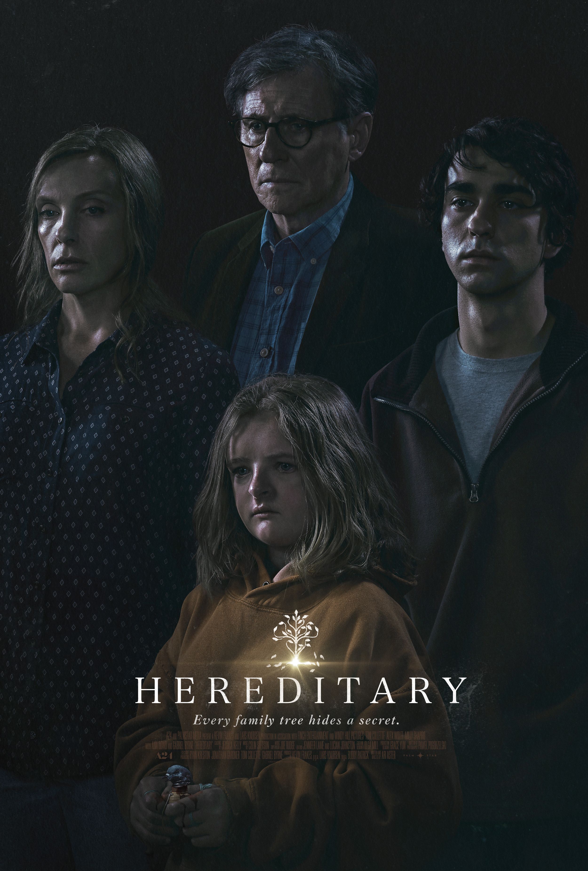
Poster for the movie ‘Hereditary’, artists unknown, digital image, 2018, seen on iTunes.
In this movie poster I noticed the strong use of shadows. The background in completely black and empty and the four people are all standing in the foreground, almost completely hidden by heavy shadows. They are standing in a tight group and their faces create a diamond shape that helps my eye move around the poster. The figures all have blank expressions and only one half of their face can be seen. What I can see of their faces is highlighted in a way to make their skin seem shiny and slick. None of them are interacting with each other but look blankly ahead. All the colors are muted and grey in tone. The title of the movie is in white towards the bottom which pulls my eye downward and I notice what the little girl is holding (looks like a pigeon).
Because this is a horror movie the use of black and strong lighting makes sense. It gives the viewer the feeling that something ominous and foreboding is about to happen as we can’t see what’s behind the figures nor what they are looking at. The way the lighting is used on their faces and the fact that they are not interacting with each other heightens this eerie feeling of menace. The lack of color also adds to the sense that something is wrong and that this is not a joyous family nor are positive things happening or will happen to them. Since the title is about things passed down within families, I assume the group is a family which then makes me think about what is connecting them and what is being inherited. Maybe the shadows symbolize that we only know one side of things and the other part of us is hidden?
After analyzing this poster I can see that the use of color, light, and composition all help to tell the viewer what the movie will be like – if the poster is this unsettling, imagine what the movie is like! I compared this poster to the others that were released for the movie and this one has the strongest ‘family’ theme with all four characters shown together. But all the posters use a similar kind of lighting and color. I feel this poster was the most effective in communicating the tone and feel of the movie to its potential audience. (I won’t say more about the movie but it’s definitely scary and has a twist ending! Also it’s the same director as Midsommar if you’ve seen that.)
